



Having been born and raised in Ankara, I would stare at the sign that said “Buraya Bakarlar” (“They Look Here”) every time I entered the metro. As a child it felt mysterious, and I invented all kinds of stories about it in my head. Only years later did I realize it was actually a brilliant billboard. Everyone really did look at the billboard that said “They Look Here.” But much like the catharsis you feel when an actor in a film glances at the camera for a moment and speaks to the audience, I had a kind of epiphany when I grew up and realized that advertisers know exactly where we look.
My decision to pursue a master’s degree started a bit like that. I wanted to understand how sales strategies and advertising work. I had read Daniel Kahneman’s Thinking, Fast and Slow and been deeply influenced by it. I took introductory psychology courses. As I researched free will and decision-making mechanisms, I began to question my own choices. We don’t have the time or energy to think at length about every choice we make during the day. Yet every day, in every small decision, we face thousands of options. Whenever we want to make a decision, we run into dozens of details. Since we can’t evaluate them all one by one, we turn to the least risky option, which is the most familiar one. But by what measure was that least risky option the best one? Should we pick the product with the most consumer reviews, or the one whose ads we see most often? Do we buy the one with the most vibrant packaging, or the one that is easiest to find? Most of the time, all of these shape our decision without our noticing, in our subconscious. That is why I started observing marketing strategies more closely, to understand how we decide what to buy and how.
While taking a sales and marketing course, my curiosity naturally began to find some academic answers. I learned, for instance, that visual communication is a language we are taught. But from cinema to supermarket shelves to food packaging, I realized that even though we understand this language in so many areas, we don’t know what we know.
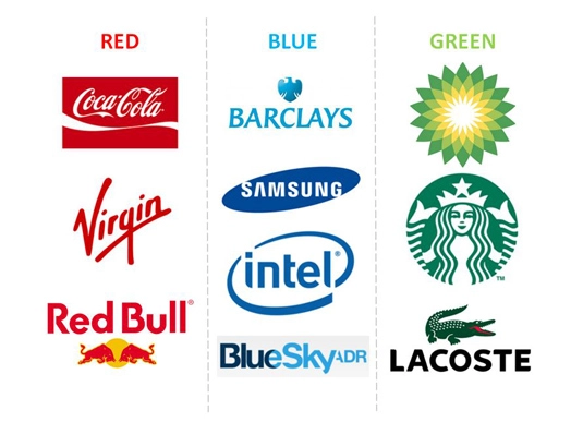
When we walk into a supermarket, we quickly notice which aisles are easier to reach, which products are at eye level, and which labels carry colorful “discount” or “points” symbols. But how much do these really matter when we decide to buy? Say you’re in a dry food aisle with dozens of options. Do you think about which rice to buy every single time? You probably go by price or quality. If there is a brand from your home country, you might prioritize it. But in the end, you go for the familiar choice that doesn’t waste much of your time.
What about a product you don’t buy regularly? Let’s stay with the rice example. I’ve been eating basmati rice lately, and in the supermarket I can of course tell what sets this non-local product apart from other rice by the text on it. But then what? I noticed that while I normally buy rice in transparent packaging, with basmati I gravitate toward packaging with colors and fonts that suit its homeland.
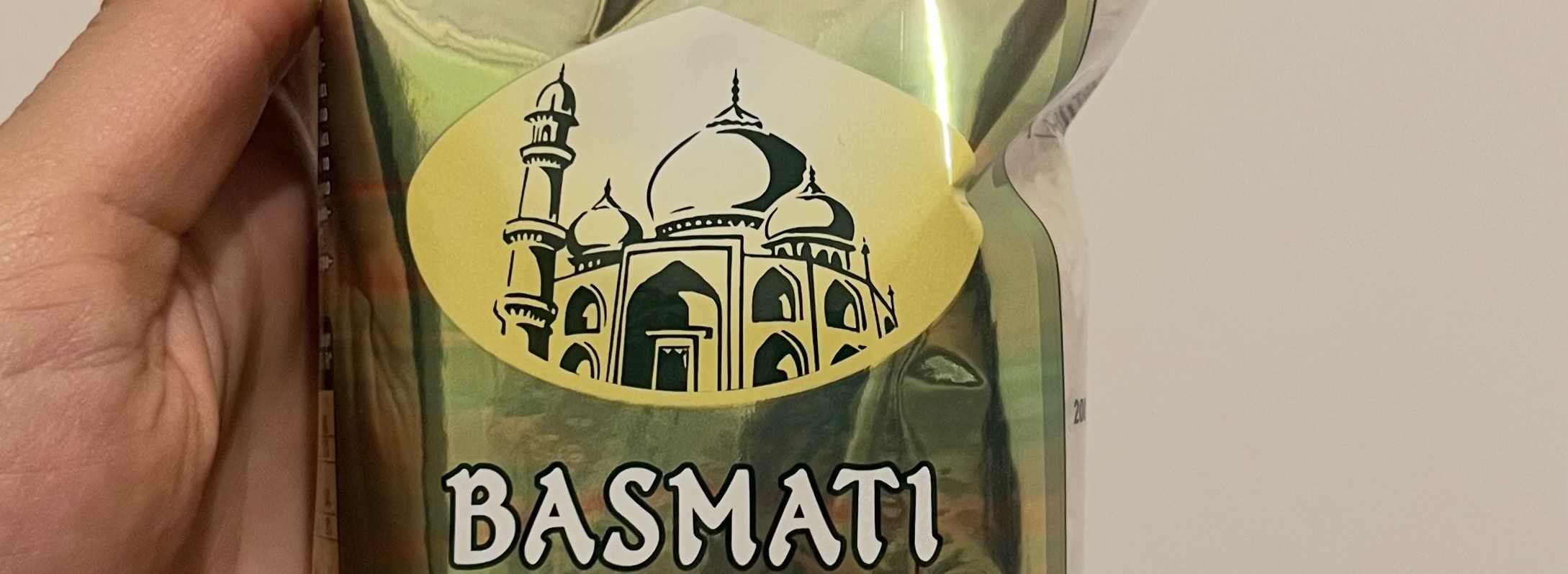
I find logos, colors and fonts that evoke India somewhat more trustworthy, as if basmati rice packaging couldn’t have muted colors or be transparent. Or as if India had its own color and font. By the time I find the packaging that matches the image in my head, I may have already made my final decision, though I still pretend to check the prices of other basmati brands.
Yet the price, whether low or high, only gives me another reason to convince myself. If it’s low, I tell myself I’ve already made the right choice. If it’s high, I tell myself it must be better quality, so I’ve made the right choice! In other words, for products where the price difference doesn’t matter much, I decide entirely based on the packaging.
While thinking about these topics, I came across some papers. One of them was a study by Baptista, Valentin, Saldaña and Behrens, published in 2021 in the International Journal of Gastronomy and Food Science. It investigated how taste expectation is shaped by packaging color: milk and dark chocolate were evaluated in seven different packaging colors. The colors were black, blue, brown, green, red, pink and yellow, and with this information alone, expectations of bitterness, fruitiness and sweetness were observed to take shape.
It is quite important that expectations and judgments form before the experience. We touched on this in more detail in another blog post ? Nostalgia has a taste - Kantara Food
While reading the Baptista study, I remembered something a confectionery manufacturer I visited years ago once told me: by changing only the color and the fruit image on the packaging, they sold the same product as banana or strawberry flavored. They certainly hadn’t done this to deceive consumers. When they used different flavorings, they observed that consumers noticed no clear difference compared to an intense mixed-fruit flavor, so they simplified their raw material purchasing. The result was quite interesting: when they used the mixed-fruit flavor and changed only the color of the candy, the dominant flavor consumers perceived could shift to strawberry or banana depending on the color. I remembered how surprised I was when I heard this, and how funny it seemed.
So what should we take from all this?
In the places where “they look here”, an image is planted in our minds, an ideal or familiar picture. We define things according to that picture and form expectations, and then we try to buy that. Packaging, in turn, forms our first impression of a product whose contents we don’t know. If we don’t question ourselves for every choice, we mostly rely on our fast decision-making system.
So what’s the problem with that? I can almost hear you asking.
A few years ago I went to Dubai for the Gulfood fair, and when I got to a foreign country, “supermarket browsing” was the first thing I prioritized. I had walked into perhaps the biggest supermarket I had ever seen. For any given product, where even big metropolises usually offer one or two varieties, there were dozens of options. The abundance of choice was dazzling and impressive, but also tiring. After examining the products with curiosity for a while, all that looking at food had stirred up a craving, so I wanted to buy a snack.
It was known that among similar products, the one with different packaging is remembered better and attracts more attention (see: the isolation effect, or von Restorff effect).
I quickly found the products with biscuit pictures on the shelves, then sorted them by color and headed for the one on the right in the photo below. But as I got closer, the Nutri-Score information on the packaging caught my eye. The product on the right, which I was about to buy because I thought it was healthier, had the same Nutri-Score as the one on the left. At that moment I had my “they look here” epiphany all over again.
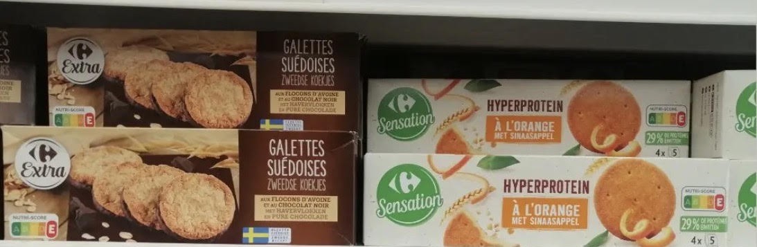
Why had I assumed the one on the right was healthier? Because many “cues,” such as the word “protein,” the colors used, a claim at the bottom saying something was reduced by a certain percentage, and an image of fruit peel, had created the perception of “healthier” in my mind. Yet when I saw the Nutri-Score, both products were in class “E,” the category that calls for caution in consumption. So the Nutri-Score information had taken away the effect of this marketing language that might otherwise have “tricked” me. What’s more, perhaps the brand never intended to trick me at all. But I had learned my own weak spot and questioned my shortcuts.
These examples may sound like small details. But when buying any product, you have probably noticed that the number of options grows every day, that online shopping offers endless pages and thousands of details for every product, that we find it increasingly hard to decide, and that we are even starting to hand our power of choice over to artificial intelligence. Our brain, bombarded with information even for an unimportant decision, finds it more efficient to use shortcuts than to evaluate so many options, and that is healthy. But some regulations are needed so that these shortcuts don’t lead us to wrong conclusions.
As I said at the start of this post, as consumers we actually understand this marketing language, and marketing strategies know what we understand. But as consumers, we often don’t realize what we know and what influences our decisions, or how much. For all these reasons, we need systems that make clearer communication and easier choices possible. Whether we build these systems with colors and letters or with logos, they need to be planned so that they serve the decision-making mechanism for the benefit of consumers and sustainability. I believe food engineers in particular, and all producers, share responsibility in this.
What do you think? Feel free to share your contributions and comments.
References
Baptista, I., Valentin, D., Saldaña, E., & Behrens, J. (2021). Effects of packaging color on expected flavor, texture, and liking of chocolate in Brazil and France. International Journal of Gastronomy and Food Science, 24, 100340. https://doi.org/10.1016/j.ijgfs.2021.100340
Kahneman, D. (2011). Thinking, fast and slow.